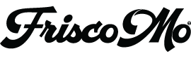

When I'm working on designs, sometimes ideas take a while, sometimes ideas come quickly, rarely do they arrive in an instant. However, with Frisco Mo, I knew how the logo was going to look instantly. I could see it in my mind. I knew the F in Frisco would have this cool, relaxed wavy script and the remainder of the word to be fun, clean and clear. I also knew Mo needed to be bold and simple and that the border around the logotype would be in the dimensions of a volleyball court. Even the tagline fell into place, "Mo Volley Mo Bettah." Mo in pidgin english, the slang used in Hawaii, means more. Bettah means better. I like the consistent cadence of matching syllables. So the word volleyball got shortened to volley. It works. The tagline is a trifecta of meaning, more volleyball, more back and forth, (collaborating and working together), as well as, the horn tooting by me that Frisco Mo volleyball designs are better than what I'd found. I love the logo. Every Frisco Mo design, from t-shirt to jewelry has it, sometimes more prominent, sometimes less. It's my signature. I figure artists sign their work.
And this artist, who's now talking in the third person, added a blog to the Frisco Mo website. If you're interested it's an easy way to follow the Frisco Mo adventure. And for my kids to one day, when they're looking, to find a bread crumb trail about their mom.